How to Choose a Product Design Agency for Your Startup: 9-Point Checklist
How to Choose a Product Design Agency for Your Startup: 9-Point Checklist
Choose a product design agency by checking 9 things before you sign: relevant product work, proof of outcomes, the named team, a discovery step, user testing, developer handoff, accessibility, a written scope with a change process, and communication. Shortlist 3 agencies, score each one from 1 to 5 on every item, and hire the highest total that fits your budget and timeline.
The checklist draws on Clutch's design pricing guide (updated September 2026), CB Insights' review of 111 startup post-mortems, Nielsen Norman Group's usability testing research, PMI's 2018 Pulse of the Profession, WCAG 2.2 and the European Accessibility Act.
I'm Uno, Account Executive at Hatypo Studio, with 2+ years as an AE. I talk with founders about scope and budget before a project starts, so I hear the questions they ask and the ones they leave out. Hatypo has delivered 250+ projects since 2021, including 15+ in fintech.
What does a product design agency do for a startup?
A product design agency turns a product idea, or a live product, into researched, tested screens that developers can build. The work usually covers user flows, wireframes, interface design, a clickable prototype and a component library. Some agencies write the front-end code too.
A startup hires one when it needs a senior team for a fixed period and has no time to recruit. That fits 3 situations: a first version before a funding round, a live product with a drop-off you can measure, or a product whose first design no longer holds its feature set.
What should you check before you hire a product design agency?
Check these 9 items in order. The first 3 tell you if the agency can do the job. Items 4 to 7 tell you how the work will run. The last 2 cover your budget and day-to-day communication.
Can the agency design your type of product?
- Relevant product work. Ask for 2 case studies of the same product type as yours: a dashboard, an onboarding flow, a payments app. Products of one type share the same hard parts, such as dense tables, user permissions or identity checks. An agency that has solved them before quotes and plans with fewer unknowns.
- Proof of outcomes. A strong case study states the problem, the constraints and what changed after launch. Read third-party reviews as well. Clutch builds its data from reviews submitted by verified clients, and you can ask any agency for 2 past clients to call.
How will the agency run the project?
- A discovery step. Before quoting, the agency should ask about your users, your business model and what you already know. CB Insights reviewed 111 failed startups in 2021, and 35% of them named no market need as a cause. Discovery is where you test that need before you pay for 60 screens.
- User testing. Ask when real users see the design, and how many. Nielsen Norman Group's research found that testing with 5 users finds about 85% of usability problems, so a round of testing is small and fast. Two rounds, one mid-project and one before handoff, give you 2 chances to fix a flow while it is still a design file.
- Developer handoff. Ask to see a past handoff file. It should have named components, every state of each screen (empty, loading, error), spacing and color values, and notes on edge cases. Ask which parts the agency builds itself. Hatypo, for example, designs mobile apps and web apps, and our development service covers websites only.
- Accessibility. Ask which standard the agency designs to. WCAG 2.2 level AA is the usual target. If you sell to consumers in the EU, the European Accessibility Act has applied since 28 June 2025 to services such as e-commerce and consumer banking. Put the standard in the scope.
How does the agency protect your budget and keep you informed?
- Written scope and change process. The scope should list the flows or screens, the deliverables, the revision rounds and the dates. PMI's 2018 Pulse of the Profession found that 52% of projects had scope creep, up from 43% five years earlier. Ask how the agency prices a change request and who approves it.
- Communication. Ask for 1 named contact, a weekly review call and a shared channel. If the agency works in another time zone, agree the overlap hours in writing. Send a detailed question during the sales stage and time the reply. You can expect a similar pace once the project starts.
How do you score the agencies on your shortlist?
Put 3 agencies side by side and score each item from 1 to 5. The total is out of 45. Use the table below as your question list on every call, so each agency answers the same 9 questions.
If 2 totals are close, compare items 1, 4 and 8 first. They cover fit, discovery and scope, and they are the hardest to fix once the project has started.
How much should a startup budget for a product design agency?
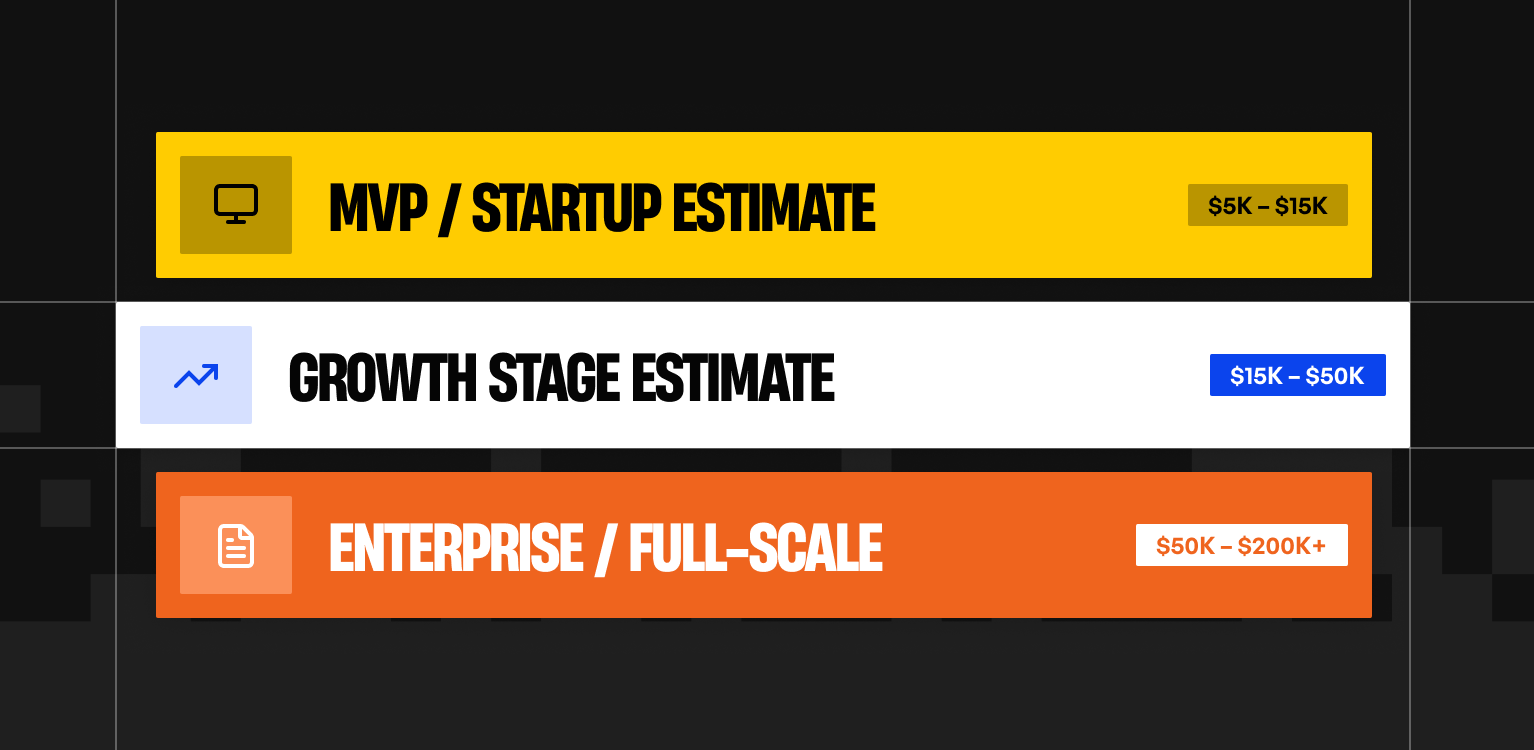
Clutch's design pricing guide, updated in September 2026, puts most product design and UX/UI projects reviewed on its platform between $10,000 and $49,999. Its average hourly rates for design agencies run from $25 to $49 in India, the Philippines and Ukraine to $100 to $149 in the United States.
Those figures come from client reviews on one platform, so use them as comparison points. Scope moves the price as well: the number of flows, the depth of research, and a design system if you need one.
Agencies price in 3 ways. A fixed fee suits a clear scope, hourly billing suits an unclear one, and a monthly retainer suits ongoing work. Clutch notes that a flat fee needs a thoroughly scoped project and leaves little room for extra iterations.
At Hatypo, projects start at $3,000 and the price follows the scope. Whichever agency you talk to, ask for a quote broken down by deliverable. You can then compare 3 quotes line by line.
Want to see how Hatypo scores on this checklist?
Run the 9 questions on us in a 30-minute call, with your brief open.
Hatypo Studio has delivered 250+ projects since 2021, including 15+ fintech projects and 20+ dashboard and SaaS projects; projects start at $3,000 and the price follows the scope.
- If you're starting a new product, we run discovery and design the first version with a handoff file your developers can build from.
- If your product is live and users drop off, we audit the flow and redesign the screens that lose them.
- If your product has grown past its first design, we rebuild the interface on a component library your team can extend.
Bring your brief or your shortlist and Book a consultation.
Heading 1
Heading 2
Heading 3
Heading 4
Heading 5
Heading 6
Lorem ipsum dolor sit amet, consectetur adipiscing elit, sed do eiusmod tempor incididunt ut labore et dolore magna aliqua. Ut enim ad minim veniam, quis nostrud exercitation ullamco laboris nisi ut aliquip ex ea commodo consequat. Duis aute irure dolor in reprehenderit in voluptate velit esse cillum dolore eu fugiat nulla pariatur.
Block quote
Ordered list
- Item 1
- Item 2
- Item 3
Unordered list
- Item A
- Item B
- Item C
Bold text
Emphasis
Superscript
Subscript
Authors :

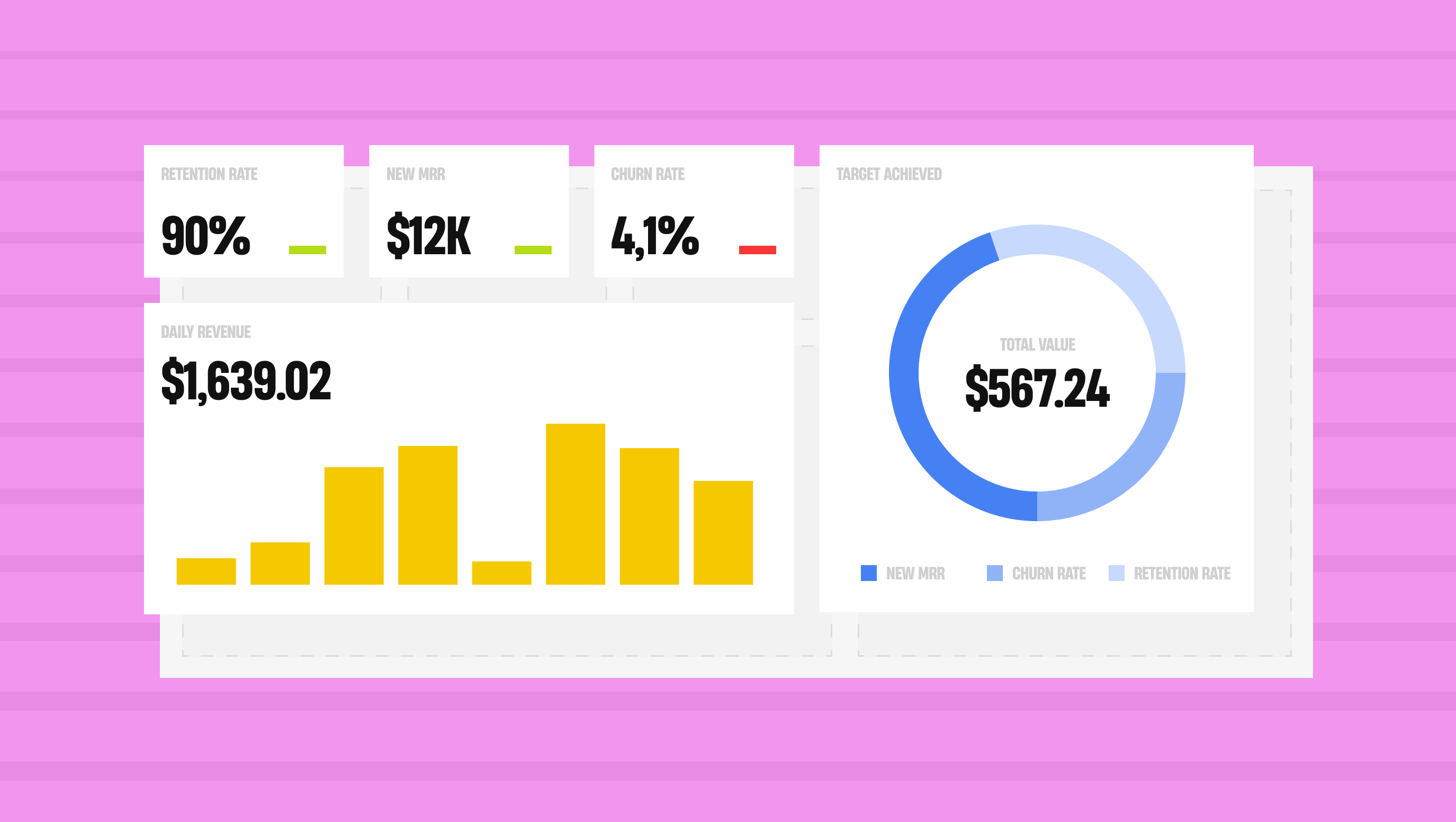
A data-heavy SaaS dashboard works when it answers one question for one audience, shows every number next to a comparison, and encodes quantities with length and position. The rest is discipline: fewer metrics per view, no decorative chart elements, colour that carries meaning but never carries it alone, and every data state designed, including empty and stale.
The 12 principles below come from our project work at Hatypo plus published research from Nielsen Norman Group, the W3C's WCAG 2.2 accessibility guidelines, and Google's Core Web Vitals thresholds for interface responsiveness.
We've delivered 20+ dashboard and SaaS projects since 2021. Most of them involved analytics screens that started simple and grew past what the first layout could hold.
What should a dashboard answer before you design a single widget?
The first 3 principles decide whether the rest matter. A beautiful dashboard that answers no particular question gets opened twice and then ignored.
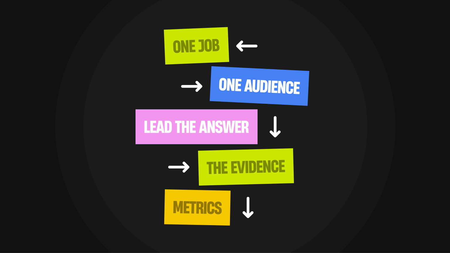
- Give the dashboard one job and one audience. A support lead watching queue health and a CFO reviewing quarterly margin need different screens, different refresh rates and different levels of detail. SAS groups dashboards into operational, analytical and strategic, and the three differ most in how often the data changes. Write the job in one sentence before you open Figma. If you can't, the dashboard isn't ready to design.
- Lead with the answer, then the evidence. Put the conclusion where the eye lands first: "Churn is 4.2%, above your 3% target" in large type, with the trend chart underneath. Users who want the raw series will scroll. Users who want the status get it in 2 seconds.
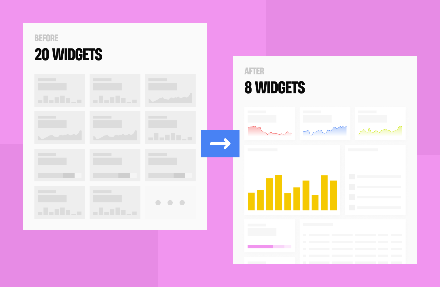
- Cap the metrics per view. We aim for 5 to 7 primary metrics on an overview, with everything else behind a tab or a drill-down. Jakob Nielsen's definition of progressive disclosure is the pattern: show the few options that serve most tasks, and put the rest one clearly labelled level down. A screen with 20 equally sized tiles has no hierarchy, so the reader has to build one.
How do you present the numbers so people read them correctly?
These 4 principles cover the part teams usually treat as decoration. It decides whether a reader gets the right answer or a plausible wrong one.
- Give every number a comparison. A churn widget reading 4.2% means nothing on its own. Add last month's 3.1% and the 3% target, and the same number now says the business is moving the wrong way. Every metric needs at least one of 3 comparisons: previous period, target, or benchmark.
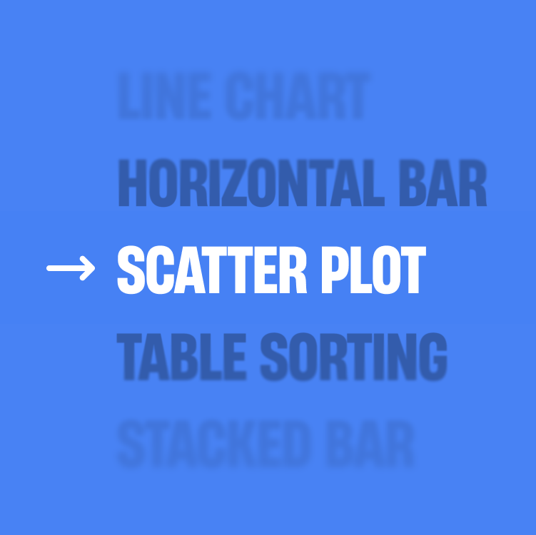
- Choose the encoding by the question. Nielsen Norman Group's guidance on dashboard visualisations is specific: length and 2D position communicate quantity fastest, because the eye processes them before conscious attention engages. Area and angle are weaker, which is why pie charts and treemaps fail at precise comparison. Use the table below as a starting point.
- Cut everything that isn't data. NN/g's rule on chartjunk is to remove elements that distract from the data. Edward Tufte coined the term in 1983. In practice: drop 3D effects, heavy gridlines, drop shadows, redundant legends and axis labels repeated on every tick. Round to 1 or 2 decimal places, because 6 decimals in a business dashboard add noise and no information.
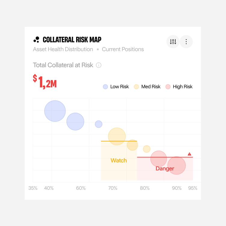
- Use colour semantically, and never alone. Pick one colour for the primary series, one for comparison, and reserve red and amber for states that need action. Around 8% of men and 0.5% of women have a colour vision deficiency, so pair colour with a label, an icon, a pattern or position. WCAG's Use of Color criterion requires exactly this.
How do you handle live data without breaking trust?
Data-heavy products fail here more than anywhere else. The happy-path screen looks fine in Figma, then production serves a half-loaded chart over a 6-hour-old cache.
- Design all 5 data states for every widget. Loading, empty, partial, stale and error. The empty state is the one teams skip, and it's the first thing a new customer sees. Write real copy for it: what the widget will show, why it's blank, and what to do next. A chart that renders an empty grid with no explanation reads as a bug.
- Make the time range and data freshness explicit. Put the active range in the widget header, not only in a filter bar at the top of the page. Add a timestamp: "Updated 14:32, 6 Oct". Teams argue over numbers that disagree, and most of the time the 2 screens are showing different ranges or different refresh times.
- Keep interaction inside the response-time limits. Nielsen's 3 limits, drawn from Miller's 1968 research, still hold: 0.1 seconds feels instant, 1 second keeps the user's flow of thought, and 10 seconds is the edge of their attention. Google's INP threshold puts good responsiveness at 200 milliseconds or less at the 75th percentile. Sorting a table or switching a filter belongs in that first band. For anything slower, show a skeleton that matches the final layout, and render each widget as its query returns rather than holding the whole screen.
How do you keep a dashboard usable as it grows?
A dashboard is rarely finished. Customers ask for 1 more metric every quarter, and after 2 years the screen holds 40 widgets nobody planned together.
- Build on a small component set with accessibility in it. Define a widget shell, a metric tile, a chart container and a table, then build every new view from those. Set the rules once: text contrast of at least 4.5:1, non-text elements and chart strokes at 3:1, and interactive targets of at least 24 by 24 CSS pixels, which are the WCAG 2.2 AA thresholds. Fixing this later means touching every screen.
- Instrument the dashboard and cut what nobody opens. Log which widgets get viewed, which filters get changed and which drill-downs get clicked. In my experience a handful of widgets carry most of the use. Move the unused ones behind a tab or delete them, and run a usability session every few releases to check that people read the numbers the way you intended.
In-House Designer vs Design Agency vs Design Subscription
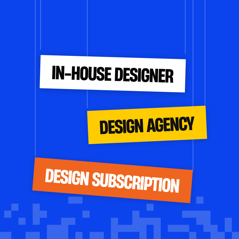
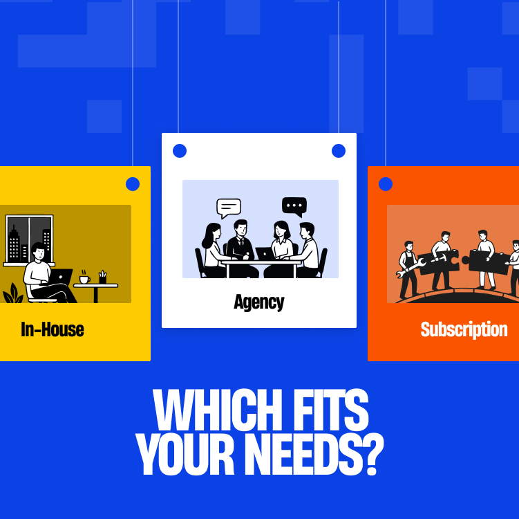
Choose an in-house designer when design work fills a full week, every week. Choose an agency when the work is a defined project with an end date. Choose a subscription when small and medium requests arrive steadily and you can brief them. In the US, an in-house designer costs about $152,000 a year with benefits, the average agency project on Clutch is $56,303, and Designjoy's subscription costs $4,995 a month.
Wage and benefit figures come from the US Bureau of Labor Statistics, hiring time from SHRM's 2026 benchmark, and turnover cost from Gallup. Agency prices come from Clutch's pricing guide, and subscription prices from Designjoy's site and a Superside roundup. Superside is a vendor, so treat its ranges as ballparks.
Key takeaways
- Benefits add about 46 cents for every wage dollar for full-time US private-sector workers, before recruiting, software and management time.
- The median nonexecutive hire takes 39 calendar days to fill, and Gallup puts replacing a leaver at half to two times annual salary.
- Clutch lists $100 to $149 an hour for US design agencies and $25 to $49 for agencies in India and the Philippines.
- In a design subscription, unlimited means an unlimited queue of requests, usually worked one to three at a time.
What does an in-house designer really cost?
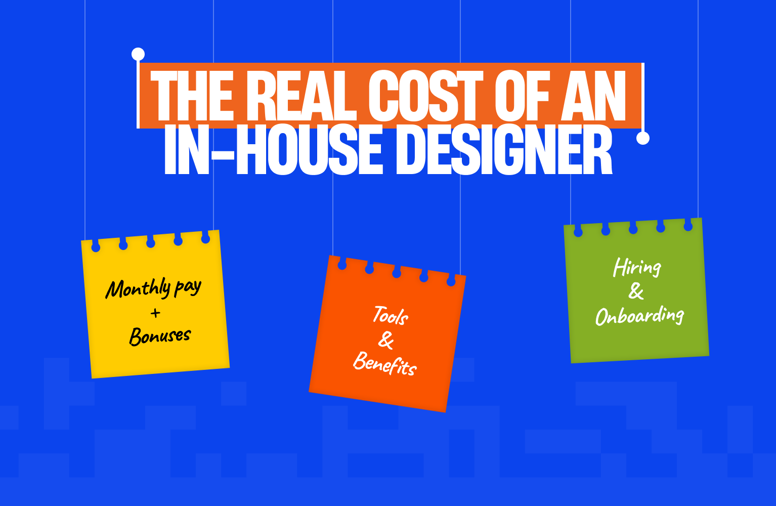
The US Bureau of Labor Statistics reports a median annual wage of $104,000 for web and digital interface designers in May 2025, across about 132,700 jobs. That figure is wages only. It excludes health insurance, paid leave, payroll taxes, equipment and software.
What do benefits add?
BLS employer cost data for June 2026 shows full-time private-sector workers cost $54.00 an hour in total: $36.97 in wages and $17.03 in benefits. Benefits are 31.5% of the total. Applying that ratio to a $104,000 salary gives roughly $152,000 a year. That is our estimate, before recruiting, software and management time.
What do hiring and turnover add?
SHRM's 2026 benchmark, covering more than 4,600 organizations, puts median time-to-fill at 39 calendar days for nonexecutive roles. Gallup's 2019 analysis estimates that replacing an employee costs one-half to two times their annual salary. For a $104,000 designer, that is $52,000 to $208,000, and the figure is a general estimate across roles.
What does an in-house designer do better?
An in-house designer builds product context. They join the same standups as engineers and product managers, know why a screen works the way it does, and can review a build the day it ships. That context grows with every release.
Where does a single hire fall short?
One designer brings one set of skills. Research, visual design, motion and front-end handoff rarely sit in the same person at senior level. Work also stops when they're on leave, and a quiet month still costs a full month of salary.
What does a design agency cost, and what do you get?
What does Clutch report for agency pricing?
Clutch's design pricing guide reports an average agency project cost of $56,303, a typical timeline of 11 months and an average monthly cost of $5,102. UX/UI design projects typically cost between $10,000 and $49,999.Hourly rates depend on location. The same guide lists $100 to $149 an hour for US agencies, $50 to $99 for Canada, Poland and Spain, and $25 to $49 for India and the Philippines. Its headline hourly average of $25 to $49 sits beside those figures, so read the location table before you budget.
What do you get for that price?
An agency gives you a team: designers, often a researcher and a project manager, working to a scope and a deadline. You can start a project without a hiring cycle, and you can bring specialist skills such as research, design systems or motion for exactly as long as the work needs them.
Where does the agency model break down?
Clutch notes that fixed-price projects need a thorough scope and leave little room for extra iterations or deliverables without a price change. The agency also rebuilds product context at the start of each project, and a long gap between projects loses some of it.
How does a design subscription work, and what does it cost?
What does "unlimited" mean in a design subscription?
A design subscription charges a flat monthly fee for a queue of requests. Superside's roundup says unlimited services carry limits: in the most common model, requests are worked one at a time, and higher tiers handle two or three at once. Revisions usually continue until you approve the result.
What do subscriptions cost?
Designjoy lists one plan at $4,995 a month: one request at a time, average delivery of 48 hours, and pause or cancel anytime. That is $59,940 a year.
Superside's roundup gives Designjoy's range as $4,995 to $7,995, with graphic-focused plans from Design Pickle and Penji between $499 and $1,695. Growmodo, which adds UI design and web development, runs from $1,795 for one dedicated designer to $8,975 for a team of five.
Where does a subscription fit, and where does it stop?
Subscriptions work for a steady flow of landing pages, feature screens and marketing assets, with one person on your side briefing each request. Designjoy's own FAQ shows the limits: larger requests are split into pieces delivered every 24 to 48 hours, and 3D, animation and video are excluded.
How does Hatypo handle subscriptions?
Hatypo works in two models: project-based and subscription. Project-based work starts at $3,000 and the price follows the scope. Our subscription suits agencies that want to collaborate with us over the long term.
How do an in-house designer, a design agency and a subscription compare?
The table puts the three models on the same factors. Cost figures are US-based and come from the sources above. The in-house figure is our estimate from BLS data.
When should you pick an in-house designer vs design agency vs subscription?
When does an in-house designer make sense?
Hire in-house when you can fill about 40 hours of design work every week for the next 12 months, and someone senior can set direction. As a rule of thumb, below that load you pay for idle time, and above it one designer becomes the bottleneck.
When does an agency make sense?
Hire an agency for a new build, a redesign or a specialist task with a clear end date, especially when no one on your team can lead design. You get a team and a deadline. Expect to spend the first weeks passing on product context.
When does a subscription make sense?
Choose a subscription when requests arrive steadily and each one is small enough to finish in a day or two: landing pages, feature screens, marketing assets. You need someone to write clear briefs. Open-ended discovery research and large product redesigns fit a project better.
Can you combine models?
Yes. Common setups are an in-house lead plus an agency for launches, and an agency-built first version handed to a subscription or a full-time hire once the product has traction. The in-house lead should join agency design reviews so the handoff holds.
What four questions settle the decision?
How many hours of design work will you have each week?
Count planned work over the next 12 months. A full week of work suits an in-house hire. A few days a week suits a subscription. An uneven load of large projects suits an agency.
Who briefs and reviews the work?
Every model needs a person on your side who can say what good looks like. Without that person, an agency can supply a lead of its own. A subscription depends on the quality of your briefs.
Which skills does the work need?
List the skills the work needs, such as research, visual design, motion and front-end handoff, and mark how many one hire could cover. The gaps tell you where an agency or a subscription needs to fill in.
What happens when the work stops?
Replacing an in-house designer costs half to two times annual salary, per Gallup's estimate. An agency project ends at delivery. A subscription pauses or cancels on the provider's terms, and Designjoy lets you pause anytime.
Healthtech UX Design: Accessibility, Compliance and Trust
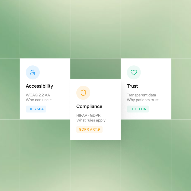
Healthtech UX works when accessibility, compliance and trust are designed as one system from the first wireframe. In practice that means building to WCAG 2.2 Level AA, which includes the 2.1 AA standard HHS requires of federally funded providers from May 2027, treating health data as a protected category under HIPAA and GDPR, and telling users plainly where their data goes.
This guide draws on the W3C's WCAG 2.2 documentation, the HHS Section 504 interim final rule, GDPR Article 7 and Article 9, the FTC Health Breach Notification Rule, the FDA's human factors guidance, and a 2019 JAMA Network Open study of health app data sharing.
I'm Adhitya, a Senior UI/UX Designer at Hatypo Studio, where our team has delivered 10+ healthtech projects since 2021. This guide covers three questions every healthtech interface has to answer: who can use it, what rules apply to it, and why a patient should trust it with their data.
What does accessibility mean in healthtech UX?
The WHO estimates that 1.3 billion people, 16% of the world's population, experience significant disability. In healthtech, one inaccessible screen can stop someone from booking a visit, reading a result or refilling a prescription.
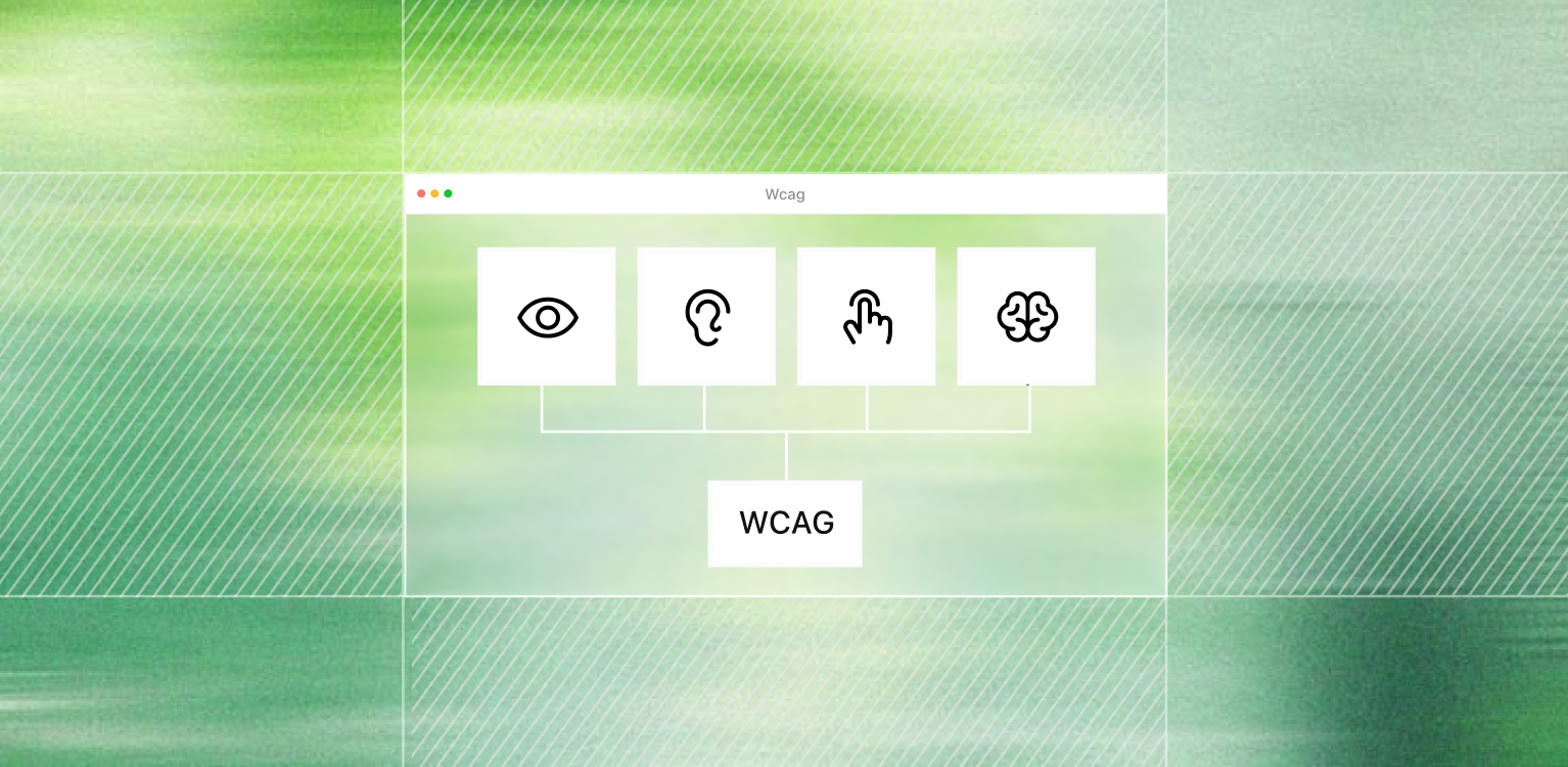
The current standard is WCAG 2.2, which the W3C published on October 5, 2023. It adds 9 success criteria to 2.1 and retires 4.1.1 Parsing. The six new Level A and AA criteria all change how health screens get designed:
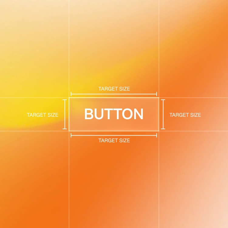
- Target Size, Minimum (2.5.8, AA). Pointer targets need at least 24 by 24 CSS pixels, or enough spacing around them (W3C). Check dose steppers, time-slot chips and close buttons first.
- Accessible Authentication, Minimum (3.3.8, AA). Login can't depend on memorizing or transcribing something unless an alternative exists (W3C). Allow paste, support password managers and WebAuthn passkeys, and let one-time codes autofill.
- Redundant Entry (3.3.7, A). Don't ask for details the patient already gave in the same process. An intake form that repeats date of birth on step 4 fails.
- Dragging Movements (2.5.7, AA). Any control operated by dragging, such as a pain-scale slider, needs a single-tap alternative.
- Focus Not Obscured, Minimum (2.4.11, AA). A sticky header or cookie banner can't fully cover the element that has keyboard focus.
- Consistent Help (3.2.6, A). Put help, such as a nurse line or chat link, in the same place on every page.
In the US, HHS's Office for Civil Rights pushed its Section 504 deadlines back one year in an interim final rule effective May 7, 2026. Recipients with 15 or more employees must meet WCAG 2.1 Level AA for web content and mobile apps by May 11, 2027. Smaller recipients have until May 10, 2028.
Design to 2.2 AA from the start. It keeps every 2.1 criterion except the obsolete Parsing one, so it covers the HHS standard without a second pass.
Which regulations shape a healthtech interface?
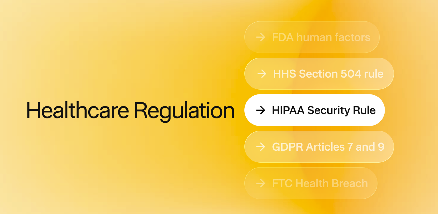
Which rules apply depends on who holds the data, what the product does, and where its users live. The table lists the ones that most often change what a screen looks like, with the design consequence of each.
HIPAA covers providers, plans, clearinghouses and their business associates. A consumer app outside that group can still fall under the FTC rule, which since its 2024 amendments names health apps not covered by HIPAA and treats an unauthorized disclosure as a breach. Consumer notices must name the third parties that received the data.
HHS has proposed a Security Rule overhaul that would require encryption, multifactor authentication and network segmentation. Fierce Healthcare reported in July 2026 that the target for a final rule slipped to July 2027. Design the MFA flow now and treat the final text as pending.
Under GDPR Article 9, health data is a special category, and processing it needs a lawful exception such as explicit consent. Explicit consent means an express statement for a specific purpose, so pre-ticked boxes and bundled terms checkboxes fail. Article 7 adds that withdrawing consent must be as easy as giving it.
If your software counts as a medical device, the FDA expects a human factors process: analyze use-related risks, then validate with representative users in realistic conditions. IEC 62366-1 is the international standard for the same process.
How do you design for trust in healthtech?
Trust starts with what the product does with data. A 2019 JAMA Network Open study by Huckvale, Torous and Larsen tested 36 top-ranked depression and smoking-cessation apps. Of those, 33 sent data to third parties, 29 sent it to Google or Facebook, and only 25 had a privacy policy.
Users can't anticipate sharing that the interface never mentions. Six practices address it:
- State the reason at the field. Put a one-line purpose beside each sensitive input, such as "We use your date of birth to match your records." A link to a policy page asks the user to leave the task.
- Audit third-party scripts. List every analytics, advertising and session-replay script on logged-in pages. Remove any whose purpose and legal basis you can't name.
- Separate consent from terms. Give each purpose one choice and no pre-ticked box. GDPR requires this for health data, and a single-purpose screen is also easier to understand.
- Make leaving as easy as joining. Put consent withdrawal and account deletion in settings, within the same number of taps as the original opt-in.
- Write at the reader's level. Use plain language, define clinical terms and spell out units. Healthy People 2030 defines organizational health literacy as the degree to which organizations enable people to find, understand and use information for health decisions.
- Show who stands behind the content. Name clinical reviewers, date medical content and keep a contact route on every page, which also supports WCAG's Consistent Help criterion.

How do you build compliance into the design process?
Compliance checks cost the least at the stage where the decision is made.
- Map the data before drawing screens. List every field, who sees it, where it is stored and which rule applies. Designers and legal share this data map, and every later screen refers back to it.
- Annotate accessibility in the design file. Add contrast ratios, target sizes, focus order and screen reader labels to each component, so developers receive the criteria together with the design.
- Design the consent and failure states first. Consent, session timeout, lockout, failed login and error screens carry compliance duties and usually get designed last.
- Test with the users who struggle most. Recruit people who use screen readers, have low vision or limited motor control, and have low health literacy. For regulated devices, run the FDA-style validation with representative users.
- Keep an evidence file. GDPR Article 7 requires you to be able to show that consent was given, so log the consent text version and a timestamp with each choice. Store audit reports and test notes beside it.
- Re-audit every release. Rules and deadlines keep moving: HHS extended its Section 504 dates in May 2026, and the HIPAA Security Rule target slipped to July 2027. Add an accessibility check to each release.
Planning a healthtech product that has to be accessible and compliant?
Healthtech screens carry accessibility, privacy and safety duties at the same time, and the design work moves faster when those constraints enter at the wireframe stage.
Hatypo Studio has delivered 10+ healthtech projects and 20+ dashboard and SaaS projects since 2021; projects start at $3,000 and the price follows the scope.
- If you're starting a new healthtech product, we design the screens, flows and consent patterns around WCAG 2.2 AA from the first wireframe.
- If your existing portal or app loses patients at login or intake, we audit those flows against WCAG 2.2 and redesign the steps that fail.
- If your product has outgrown its first version, we rebuild the design system so every component carries its accessibility and consent rules.
Tell us which stage you're at and we'll scope it together: Book a consultation.